The 2026 Shortlist
Hidden Information Behind Fancy Words: A Comparative Data-Driven Analysis of ESG Reports
Weiqi Han, Yupu Chen, Yunzhong Luo, and Xiaoyu Zhang
City University of Hong Kong, China
Abstract -- Does a high Environmental, Social, and Governance (ESG) score actually mean a company is doing good, or just talking well? In this video, we evaluate 20 years of ESG frameworks to uncover a major gap between corporate rhetoric and real-world impact. We analysed the ESG reports of 15 market leaders across five industries using NLP techniques and found that top ESG ratings rarely correlate with financial stability. We also highlight a “reporting imbalance” where Big Tech prioritizes environmental metrics while systematically marginalizing the governance dimension. Furthermore, our sentiment analysis results reveal that corporate discourse remains overwhelmingly positive regardless of actual output. Finally, a case study of NVIDIA highlights potential flaws in third-party rating methodologies. Through this project, we would like to advocate for a transition to standardized, data-driven frameworks that reduce corporate’s selective reporting and prioritize longitudinal physical evidence over subjective disclosure.
A Cat's Day
Aoshuang Zhang, Wenxuan Gu, Yu Zhong, Jinghong Lin, and Xiaoyu Zhang
City University of Hong Kong, China
Abstract -- This video depicts a day in the world of cats through data visualization. As cat lovers, we centered our story on cats, and explore their daily lives from cat breed characteristics, behavioral patterns to dietary nutrition. For breed and coat patterns, we collected global data on breed origins and coat colors from official sources (e.g., CFA, TICA) and created interactive visualizations. We also analyzed datasets from Hugging Face to examine vocalization features across contexts and daily activity time allocation, using these analyses to tell behavioral stories. For nutrition, we analyzed U.S. pet-food industry reports and Nielsen data to categorize ingredients and visualize dietary composition. Through a light, joyful narrative, we aim to turn data analysis results into engaging visual stories that share rich cat knowledge, and celebrate our endless love for these tiny, furry friends.
Chinese Canine Heritage: A Data Narrative for China’s Indigenous Dogs
Shuai Zhang, Qiaoqiao Jin, Qiushi He, Qing Chen, Yang Shi, and Nan Cao
Tongji University, China`
Web Link: https://chortlezs.github.io/
Abstract -- China's indigenous dog breeds represent a unique native canine lineage shaped through long-term coexistence with human societies, carrying significant cultural memory and ecological value. Yet they are often mislabeled as “mongrels” in contemporary discourse, leading to misunderstanding and neglect. To address this issue, we developed Chinese Canine Heritage, a scrollytelling website that revitalizes cultural recognition of China's native dogs. Built on the Next.js framework, the project adopts a data-driven storytelling approach centered on native dogs as loyal human companions. The narrative integrates historical artifacts, classical literature, scientific interpretation, and policy regulations, guiding users from awareness and empathy toward responsibility for conservation. Using D3.js, the system supports interactive data exploration and translates abstract cultural and policy information into engaging visual narratives, aiming to enhance scientific literacy, promote conservation awareness, and present China's indigenous dogs to a global audience.
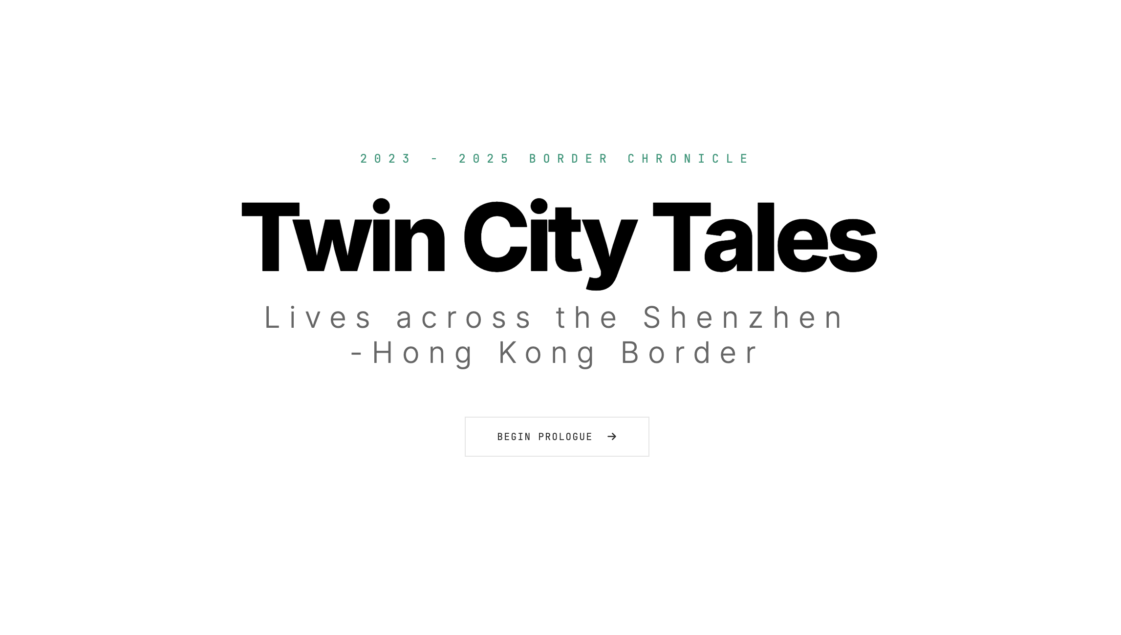
Twin City Tales: Lives Across the Shenzhen‑Hong Kong Border
Mingxi Li, Lu Junchi, and Yiwei Zhou
City University of Hong Kong, China
Web Link: https://twincitytale-visstory2026.netlify.app/
Abstract -- Twin City Tales is a web-based notebook for data-driven storytelling that visually explores everyday life across the Shenzhen–Hong Kong border. Historically, this border has marked two distinct social systems, cultures, and ways of living, while also sustaining continuous interaction between the two cities. After COVID-19, these connections resumed in altered forms, giving rise to a new mode of cross-border daily life. The project builds a linear narrative from Hong Kong government–released daily passenger flow data across major control points from 2021 to 2025. Through data cleaning, temporal comparison, and visual annotation, it traces how cross-border mobility returns and reorganizes over time. Beyond numbers, the team conducted field research and ethnographic observation of cross-border communities to add human texture and lived context. In the post-pandemic context, the story poses a proposition: What does this reshaped border truly mean? And how people deal-with time pressure and cultural divides?
Poetical Science: Decoding Ada's Story through a Multi Perspective Lens
Rufei Han1, Jieying Ding1, Haipeng Zhu1, Wang Su1, Zhiliang Shen1, Chen Yi1, Haozhong Zheng1, Yanzhuo Chen1, Ruoyun Dai1, and Siming Cheng2
1Hithink RoyalFlush Information Network Co., China; 2Fudan University, China
Abstract -- Captured through a first-person POV, this video depicts a time-traveling encounter between modern-day Jeff and Ada Lovelace. Using the AI tool Lens, Jeff reconstructs Ada’s legacy not as a static biography, but as a dynamic interplay of conflicting perspectives. The narrative juxtaposes Ada’s visionary "Poetical Science" against Charles Babbage’s rigid engineering logic and her mother’s disciplined restraint. By visualizing historical constraints and gender biases, the video highlights why Ada remains the ultimate icon for the AI era: she was the first to realize that machines could manipulate symbols beyond numbers. It concludes with a profound reflection on how technology can help us unmask the structural prejudices that shape our understanding of history and truth.
Visualizing the Storm: Cyber Violence in the Era of Distorted Information
Zherui Zhou, Zihan Qiu, Sheng Zhang, Qing Chen, Yang Shi, and Nan Cao
Tongji University, China
Web Link: https://dontwannagetbald.github.io/visualizing-the-storm.github.io/
Abstract -- Online violence is a widespread digital phenomenon driven by misinformation and collective emotional escalation, leading to serious psychological and social harm. We designed an interactive data story program that combines speculative narrative and data-driven analysis to encourage reflection on individual responsibility in online environments. First, we constructed a speculative future scenario where online discourse is “corrected” through emotional detection and factual guidance. Then, the narrative shifts back to the present, revealing how misinformation and collective hostility intertwine through a real-world-inspired cyberbullying case. We collected 64 high-impact online violence incidents in China over the past five years from mainstream news media, and then we collected and analyzed comments on Douyin. For visual encoding, we adopted a hurricane-inspired metaphor to illustrate the non-individual and uncontrollable nature of mass online aggression. We aim to raise awareness of the lasting impact of online violence and foster more ethical participation in digital information ecosystems.
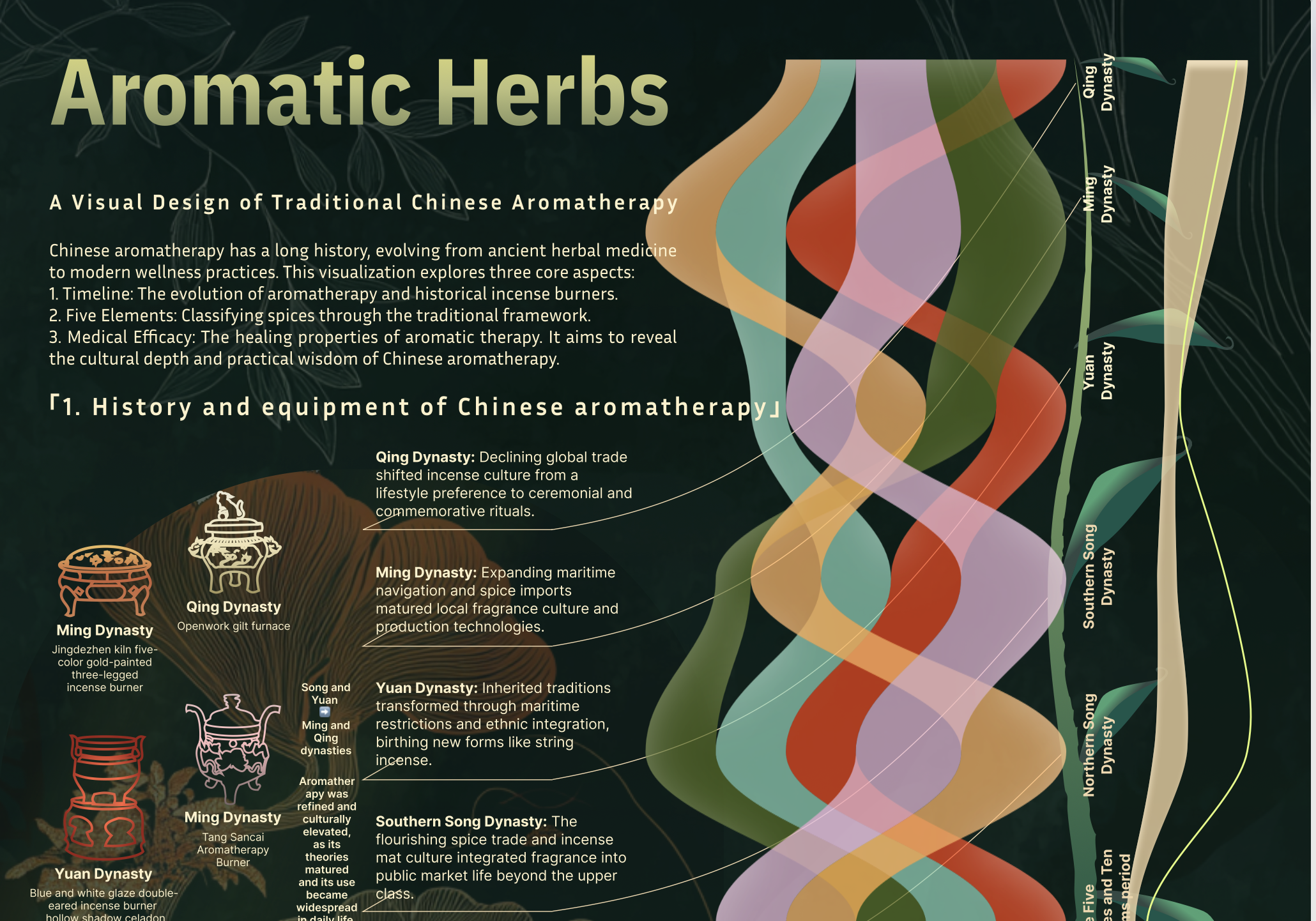
Aromatic Herbs: A Visual Design of Traditional Chinese Aromatherapy
Shuai Zhang, Qiushi He, Qing Chen, Yang Shi, and Nan Cao
Tongji University
Infographic Link: LINK
Abstract -- Chinese aromatherapy represents a millennium-old wisdom, blending traditional culture with holistic healing. This visualization project explores the rich history and contemporary value of this ancient practice. Drawing data from classical medical texts like The Compendium of Materia Medica, museum collections of incense tools, and modern medical research, we construct a comprehensive visual narrative. The design features a timeline illustrating the evolution of incense tools, a classification system based on the "Five Elements" theory to encode fragrance attributes, and a therapeutic module revealing physical and mental health benefits. By fusing imagery, color coding, and knowledge structures, this work transforms complex historical data into an intuitive experience. It invites viewers to rediscover the profound cultural heritage of Chinese aromatherapy and understand its enduring relevance in modern wellness.
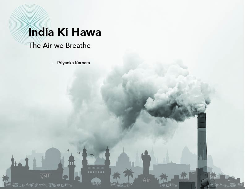
India Ki Hawa, The air we breathe
Priyanka Karnam
Northeastern University
Web Link: https://priyanka-karnam-india-aqi-visualization.vercel.app
Abstract -- Air pollution in India has become one of the most urgent environmental and public health crises with rapid urbanization, millions of people are exposed to hazardous air quality. This project presents a scroll-based data storytelling experience that explores the complex and multi-layered nature of air pollution across India.Through interactive visual narratives, the work examines the major sources of pollution, its temporal patterns across seasons and years, and its geographical disparities between regions and cities. The story highlights how air pollution is not only an environmental issue, but also a social challenge, affecting billions and contributing to severe health impacts. This project aims to improve public understanding of why India’s air quality crisis persists and what interventions can lead to long-term improvement. Ultimately, the project emphasizes that while meaningful change requires time, immediate action is essential, because clean air is not a luxury, but a fundamental right and responsibility.
A Small Boat in a Great Tide: One Man’s Journey Through China’s Modernization
Xingyu Lan1, ZhiJing Pan1, Zhengqi Xia2, Kitee Li3>, Wenyu Huang1, Ruyun Dai4, Wenxuan Luo5, Qingyang Liu1, Siyuan Zhang1, Xiangtian Ji6, and Dai Yu7
1Fudan University, China; 2Communication University of China, China; 3Freelance Artist; 4Hanyang University, Korea; 5Central Academy of Fine Arts, China; 6Huazhong University of Science and Technology, China; 7PhoeHub Technology Co., China
Web Link: https://kitee0325.github.io/modern-chronicle/
Abstract -- Over the past century, China has risen from poverty to a global power. The world watches with curiosity, yet often knows little of the stirring voyage of its modernization - a journey shaped not only by statistics, but by the lives of ordinary people. By chance, we came across the oral history of Zhao Dachun, an ordinary Chinese man born in 1934. As we helped digitize his memories, we realized that the destinies of an individual and a nation are like a boat upon a river - rising and falling together, carried forward by the same currents of time. Therefore, in this visual data story, we aim to tell a tale of an individual’s life resonating with the tides of time, while also giving readers a human-scale glimpse into China’s journey toward modernization.
The Eight Treasers Pilgrimage
Huizhu Han
Beihang University, China
Abstract -- In today's society, increasing pressure has led more people to perceive life as uncontrollable. Drawing on compensatory control theory and conceptual metaphor theory, we integrate the promotion of the Eight Auspicious Symbols culture with metaphysical rituals. This approach not only helps people understand traditional culture but also provides psychological comfort.